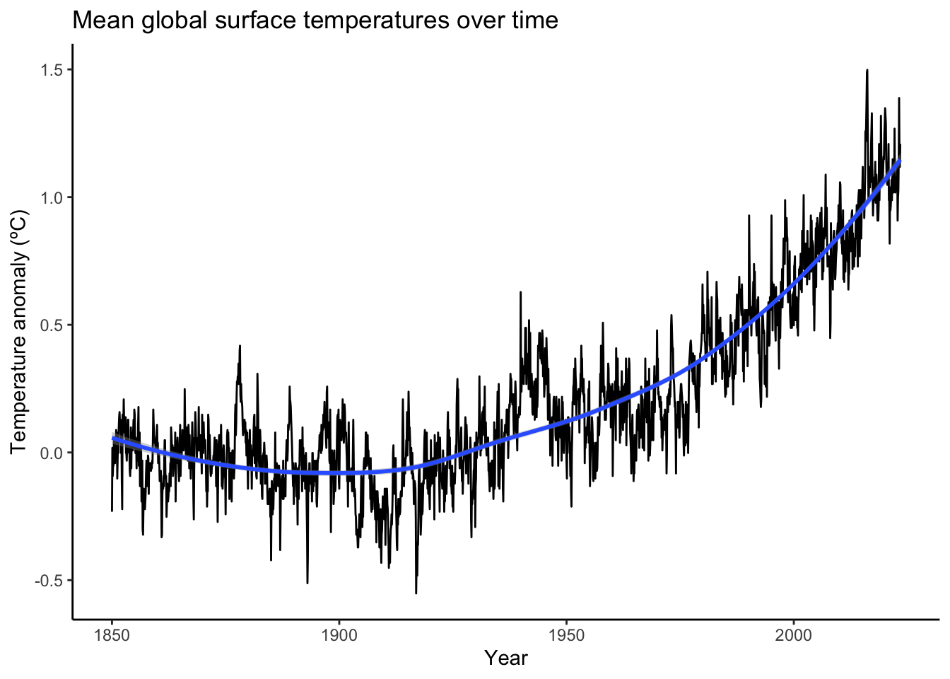
When you think of “climate change,” what do you think of? Heatwaves? Droughts on one side of a stationary jet stream while floods occur on the other side? Temperature graphs like this time series graph of NOAA surface temperature data? Note: I rescaled the temperature anomalies to the 1850s mean anomaly so the 1850s mean is the zero point. Why? So we can fully grasp just how much the global mean temperature has already risen over just the last 163 years.
Show the code
library(tidyverse)options(scipen =999)NOAA <-read_csv("https://www.ncei.noaa.gov/access/monitoring/climate-at-a-glance/global/time-series/globe/land_ocean/all/5/1850-2023/data.csv", skip =4)NOAA$Date <-as.character(NOAA$Year) %>%paste0("01") %>%as.Date(NOAA$Year, format ="%Y%m%d")NOAA <- NOAA %>%select(Date, Anomaly)# Create decade variabledecades_a <- NOAA %>%mutate(Decade =floor_date(Date, years(10))) %>%mutate(Decade =as_factor(year(Decade)))# Mean, standard deviation, standard error of mean, max, and min of each decademean1850s <- decades_a %>%group_by(Decade) %>%summarize(mean =mean(Anomaly)) %>%filter(Decade ==1850 ) %>%select(mean)# Rescale the y-axis so the zero-point is the mean of the 1850sNOAA$Anomaly <- NOAA$Anomaly - mean1850s$mean# Plot meansp <-ggplot(NOAA, aes(x = Date, y = Anomaly)) +theme_classic() +geom_line() +geom_smooth(method ="loess", formula = y ~ x) +labs(title ="Mean global surface temperatures over time",x ="Year",y ="Temperature anomaly (ºC)")p
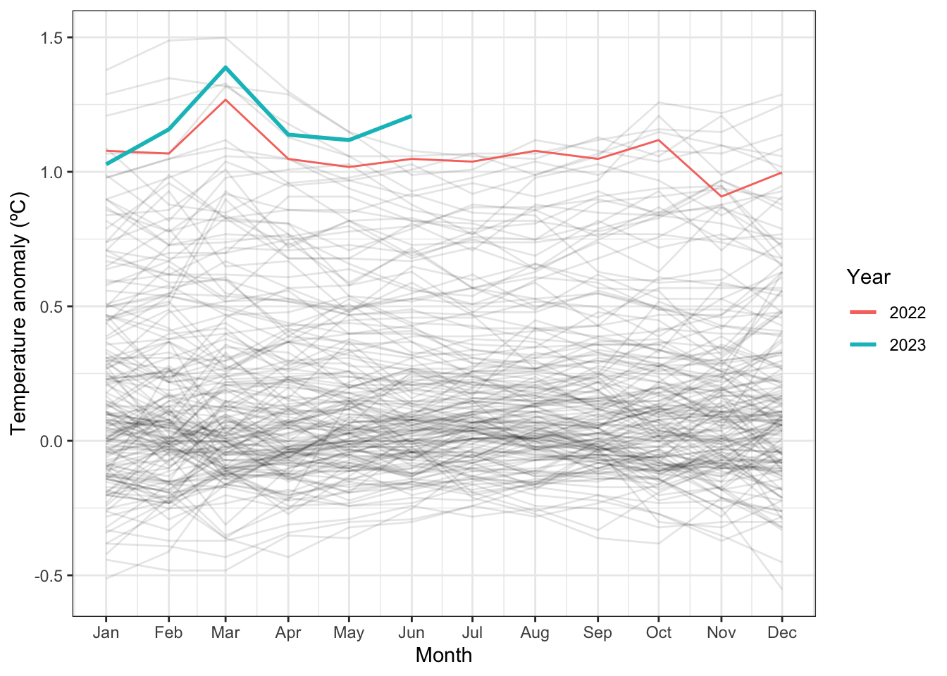
Or maybe you’ve seen graphs like this seasonal graph, also of NOAA surface temperature data:
Show the code
s <- NOAA %>%mutate(Year =factor(year(Date)),Date =update(Date, year =1)) %>%ggplot(aes(x = Date, y = Anomaly, colour = Year)) +scale_x_date(date_breaks ="1 month", date_labels ="%b") +geom_line(aes(group = Year), colour ="black", alpha =0.1) +geom_line(data =function(x) filter(x, Year ==2022), lwd =0.5) +geom_line(data =function(x) filter(x, Year ==2023), lwd =1) +theme_bw() +labs(y ="Temperature anomaly (ºC)",x ="Month")s
Yes, this past June was the hottest June on record (although not the hottest month on record. That distinction belongs to March 2016).
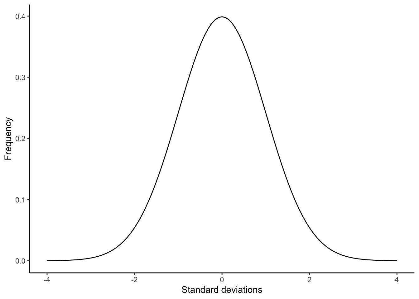
I’d like to show a third way to visualize climate change, one that I think emphasizes how probabilities change over time. Climate change isn’t just a linear change in global temperatures. It also changes the probability distribution. What am I talking about? Bell curves, also known as density curves.
Most of us are familiar with bell curves, especially from statistics class. Remember this?
Values that fall close to the mean are the most likely, with values becoming less likely as they fall further and further away from the mean. With a normal distribution, 68.26% of all values will be within one standard deviation of the mean and 95.44 within two standard deviations of the mean. Everything more extreme than 2 standard deviations from the mean only make up 4.56% of all values. Three standard deviations? 0.26% of all values.
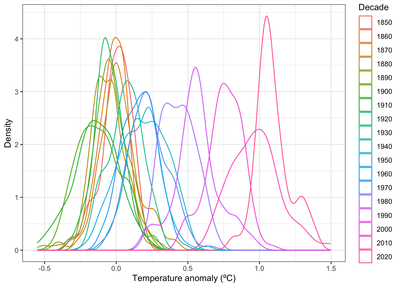
So, what does this have to do with climate change? Climate change shifts the weather bell curve and therefore changes the probability of extreme events. An event that may have been a 1 in 1,000 years event may now be a 1 in 100 years event. I’m going to illustrate with global mean temperatures as it’s readily available and convenient. As always, if you want the code I used, just open the code box
Show the code
decades_b <- NOAA %>%mutate(Decade =floor_date(Date, years(10))) %>%mutate(Decade =as_factor(year(Decade)))# Mean, standard deviation, standard error of mean, max, and min of each decademean_and_stdev <- decades_b %>%group_by(Decade) %>%summarize(mean =mean(Anomaly),stdev =sd(Anomaly),n =length(Anomaly),se = stdev/sqrt(n),max =max(Anomaly),min =min(Anomaly))# Z score calculationsmax1850 <- mean_and_stdev %>%filter(Decade ==1850) %>%select(max)mean1850 <- mean_and_stdev %>%filter(Decade ==1850) %>%select(mean)sd1850 <- mean_and_stdev %>%filter(Decade ==1850) %>%select(stdev)mean2010 <- mean_and_stdev %>%filter(Decade ==2010) %>%select(mean)sd2010 <- mean_and_stdev %>%filter(Decade ==2010) %>%select(stdev)z_score <- (max1850 - mean2010)/sd2010z_score_mean <- (mean2010 - mean1850)/sd1850# Create density plots for each decaded <-ggplot(decades_b, aes(x = Anomaly, colour = Decade)) +theme_bw() +geom_density() +labs(x ="Temperature anomaly (ºC)",y ="Density")d
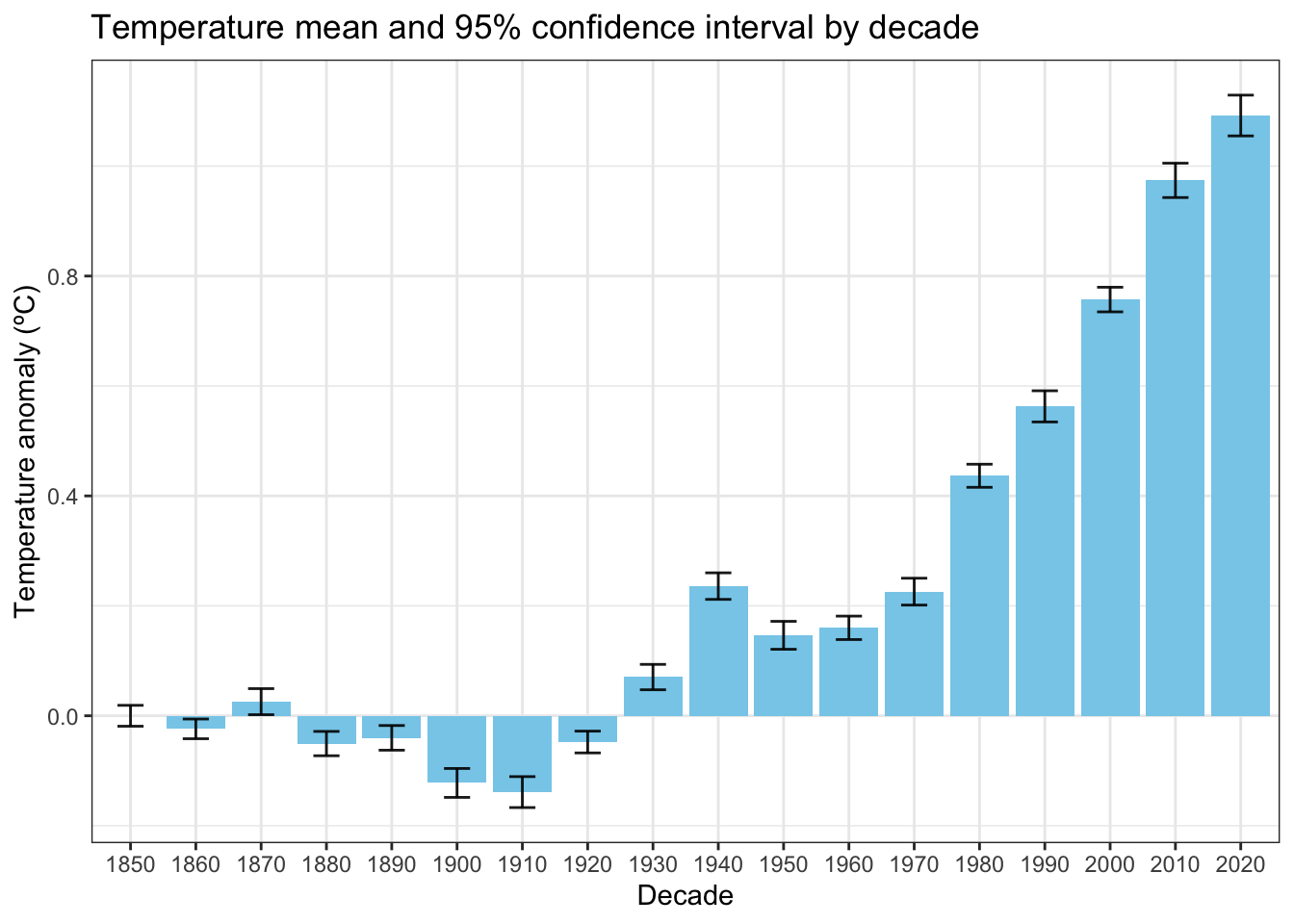
Up until the 1920’s, global mean surface temperature anomaly hung around the 1850s mean temperature anomaly of 0ºC. Starting in the 1930s, global temperatures began rising, accelerating after 1970 until even the warmest months of the 1850s were too cold to be even possible.
Show the code
# Plot means and confidence intervals for each decadem =ggplot(mean_and_stdev) +theme_bw() +geom_bar(aes(x = Decade, y = mean),stat ="identity",fill ="skyblue") +geom_errorbar(aes(x = Decade, ymin = mean -qt(0.975, df = n -1) * se,ymax = mean +qt(0.975, df = n -1) * se),width =0.4,alpha =0.9) +labs(x ="Decade",y ="Temperature anomaly (ºC)",title ="Temperature mean and 95% confidence interval by decade")m
For example, the highest monthly mean temperature anomaly of the 1850s was 0.208ºC. That month is -4.4310224 standard deviations below the mean of the 2010s. The probability of that getting a monthly global mean that low in the 2010s? Only 0.0004689%. Not quite zero but so low it might as well be zero. And that’s the warmest month of the 1850s.
Using the 1850s mean as the reference is even more telling. By definition, the mean has a probability of 50%. In the 2010s, the mean was 0.9740833ºC. That’s 9.2602535 standard deviations above the 1850s mean. The probability of getting a monthly mean temperature that high in the 1850s? 0%.
That’s what I mean by climate change is changing probabilities. Thanks to climate change, the chances of getting extreme events has shifted. In this case, global monthly mean temperatures have risen so much that what was an impossibly warm extreme in the 1850s is now the average with a probability of 50%. Note that I didn’t use the 2020s as we’re only 3.5 years into that decade—and that average, so far, is higher still compared to previous decades.
Shifting probabilities like this example is, in my opinion, the real hallmark of climate change. While temperatures may not be setting record highs every day or month or year, the chances have definitely shifted toward hotter temperatures.
Comment Section
Notes, suggestions, remarks? Feel free to leave a comment below.